What color's all-embracing spirit enriches mind, body, and soul?


“Color is a power which directly influences the soul.”
—Wassily Kandinsky


In the ‘80s I wore lots of dayglow and bright colors. Even thought I’m wearing a baby pink leather jacket, I was bold color forward!


PANTONE 13-1023 Peach Fuzz is the color for 2024. Pantone's website says Peach Fuzz "captures our desire to nurture ourselves and others. It's a velvety, gentle peach tone whose all-embracing spirit enriches mind, body, and soul." This sounds great. I love to nurture, and I love the idea of enriching my mind, body, and soul, but this color feels to me like a boring '80s flashback. I have noticed that many brands are embracing colors with an '80s vibe, so this is happening, like it or not. Will we all be feathering our hair and wearing leg warmers? Time will tell.

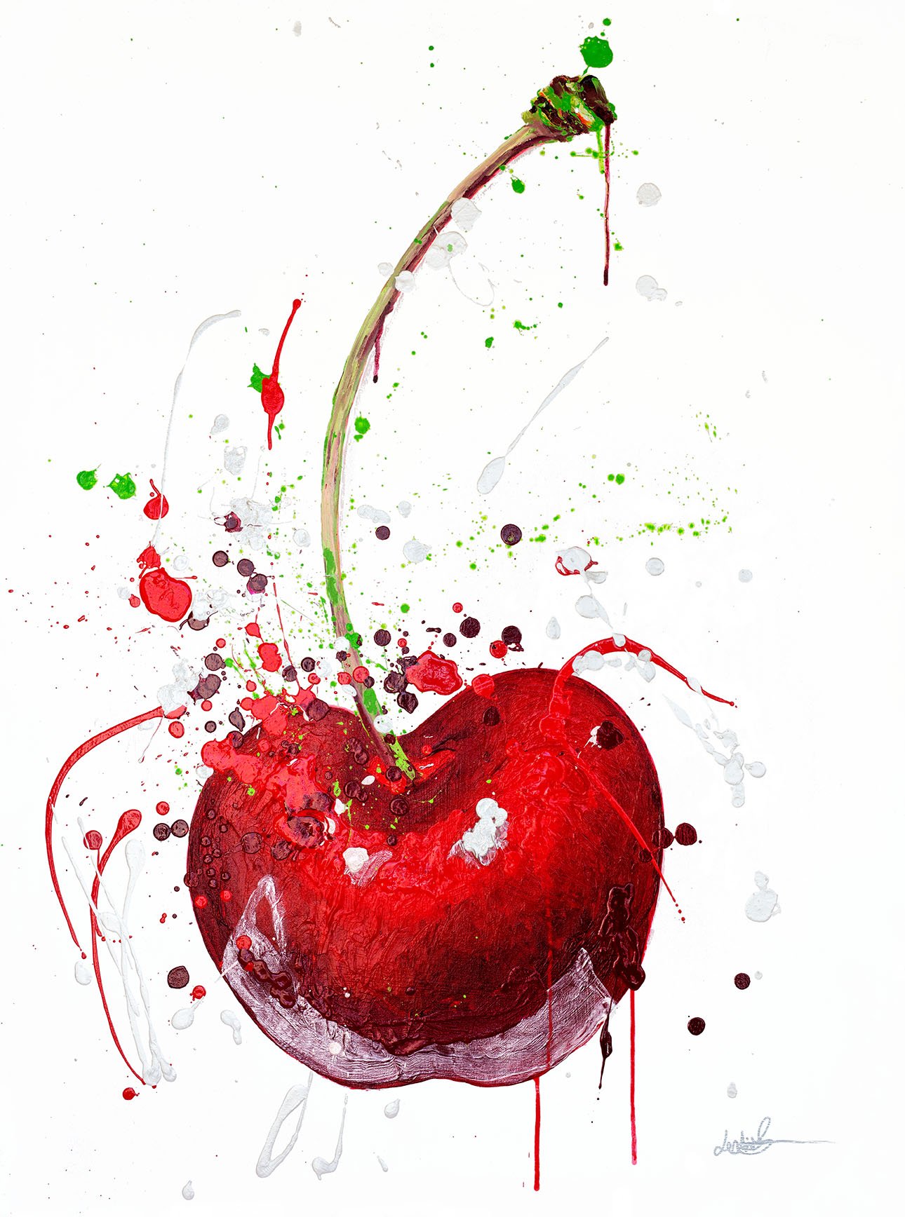
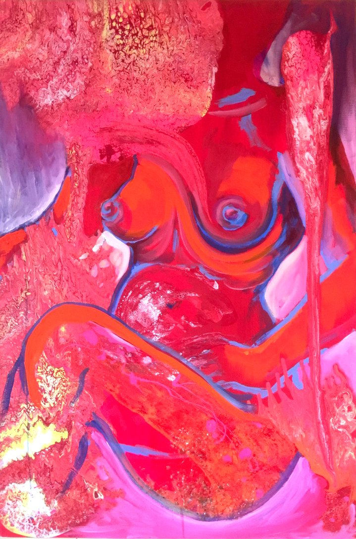
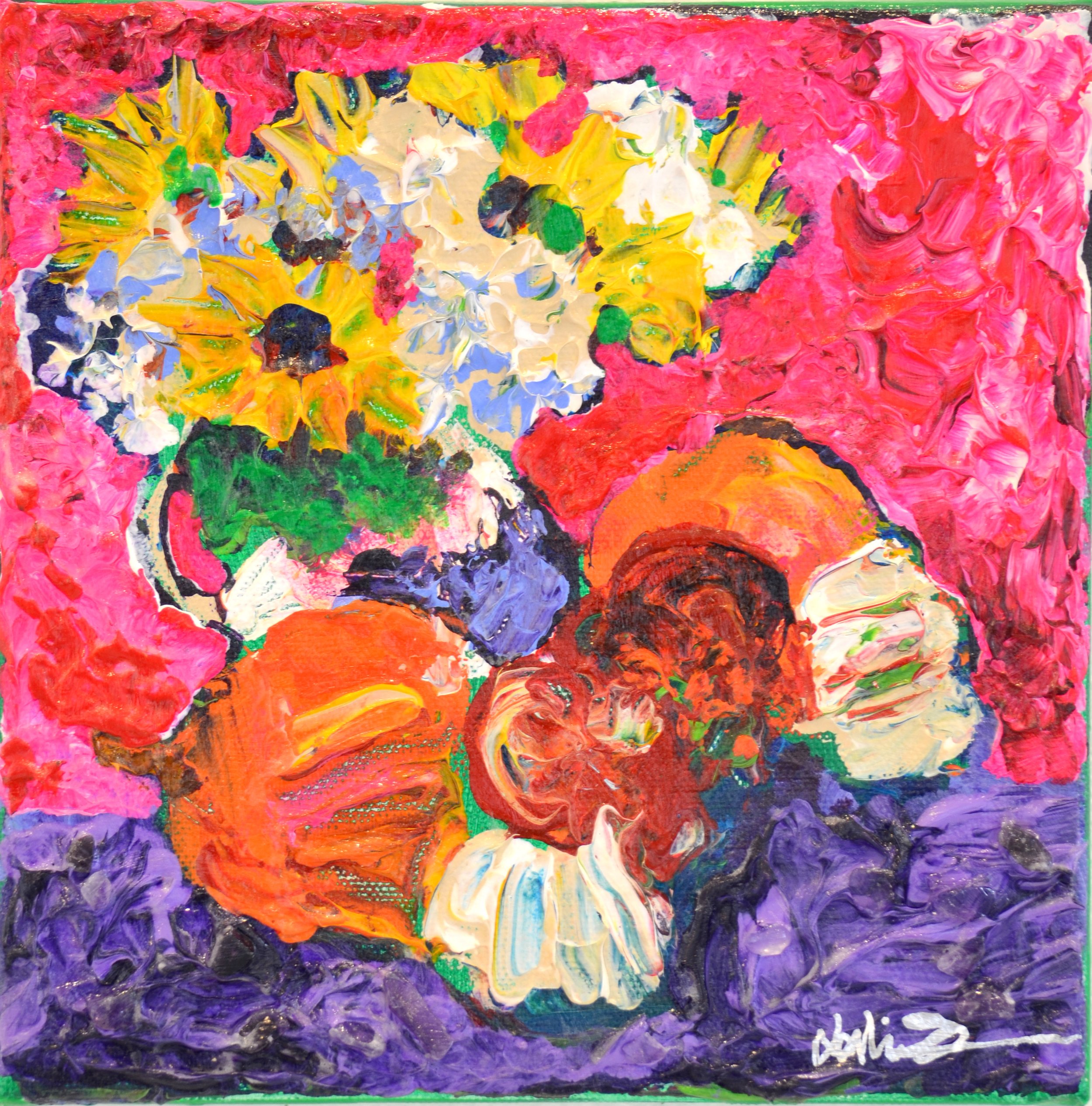
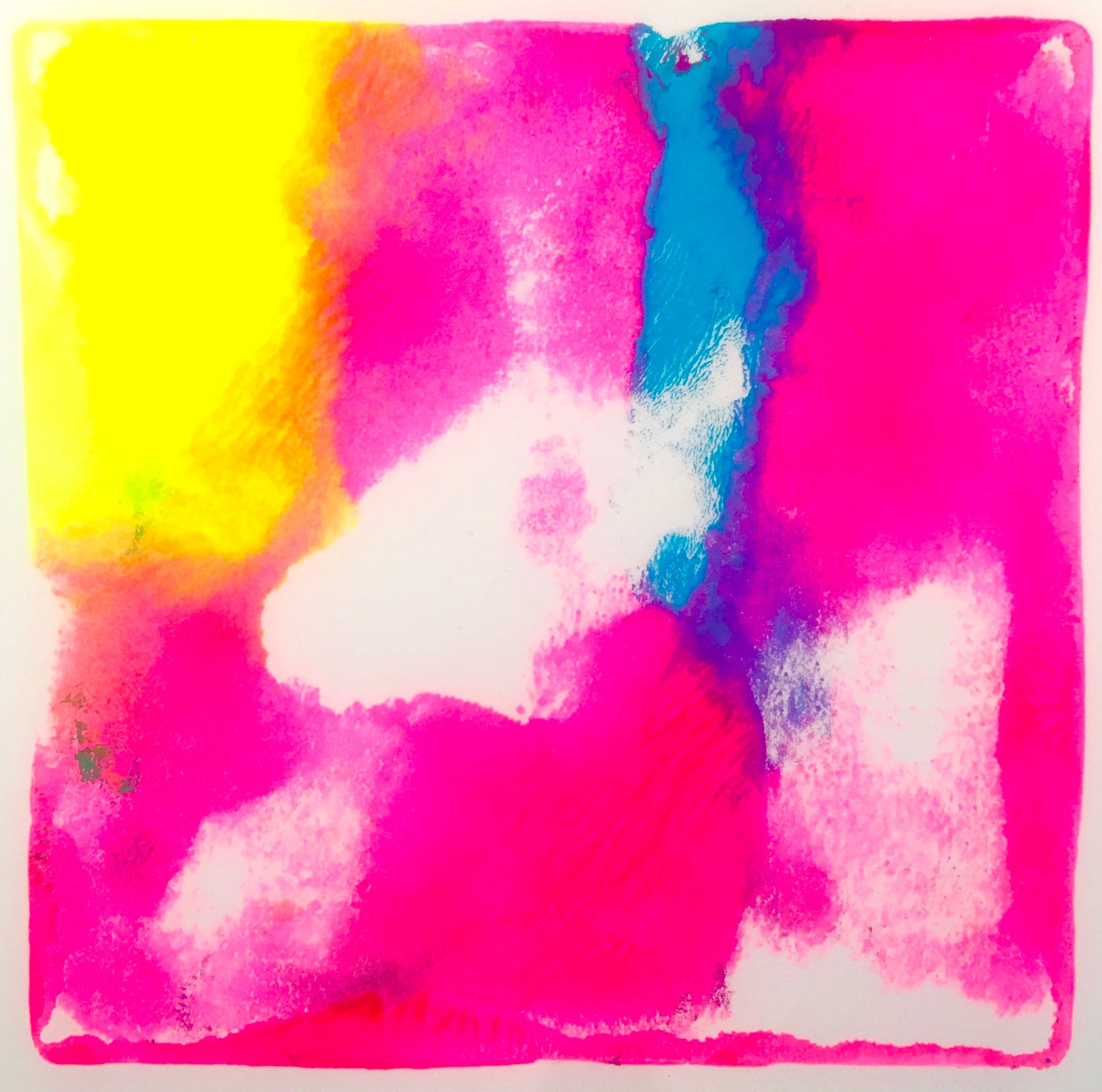
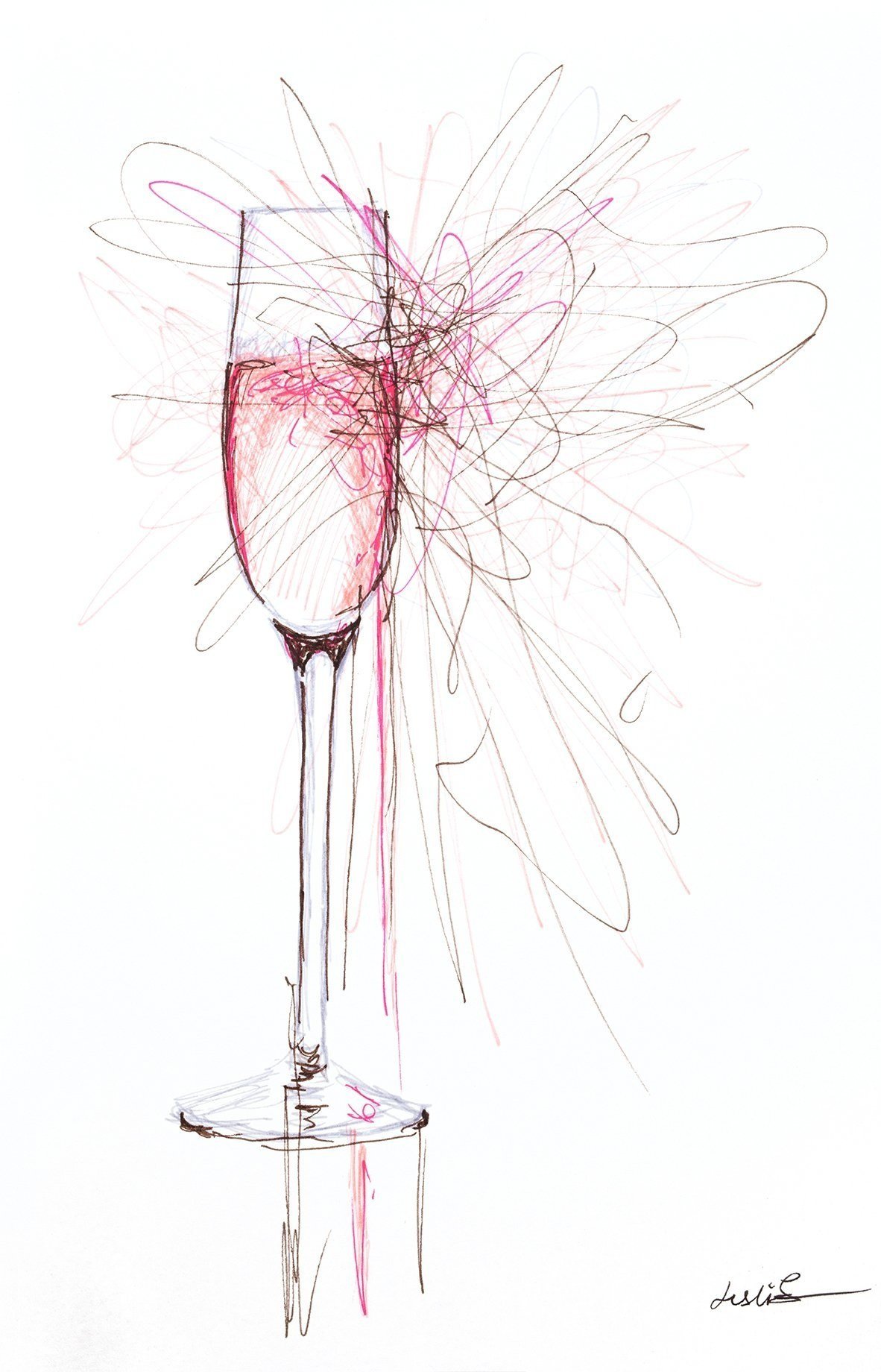
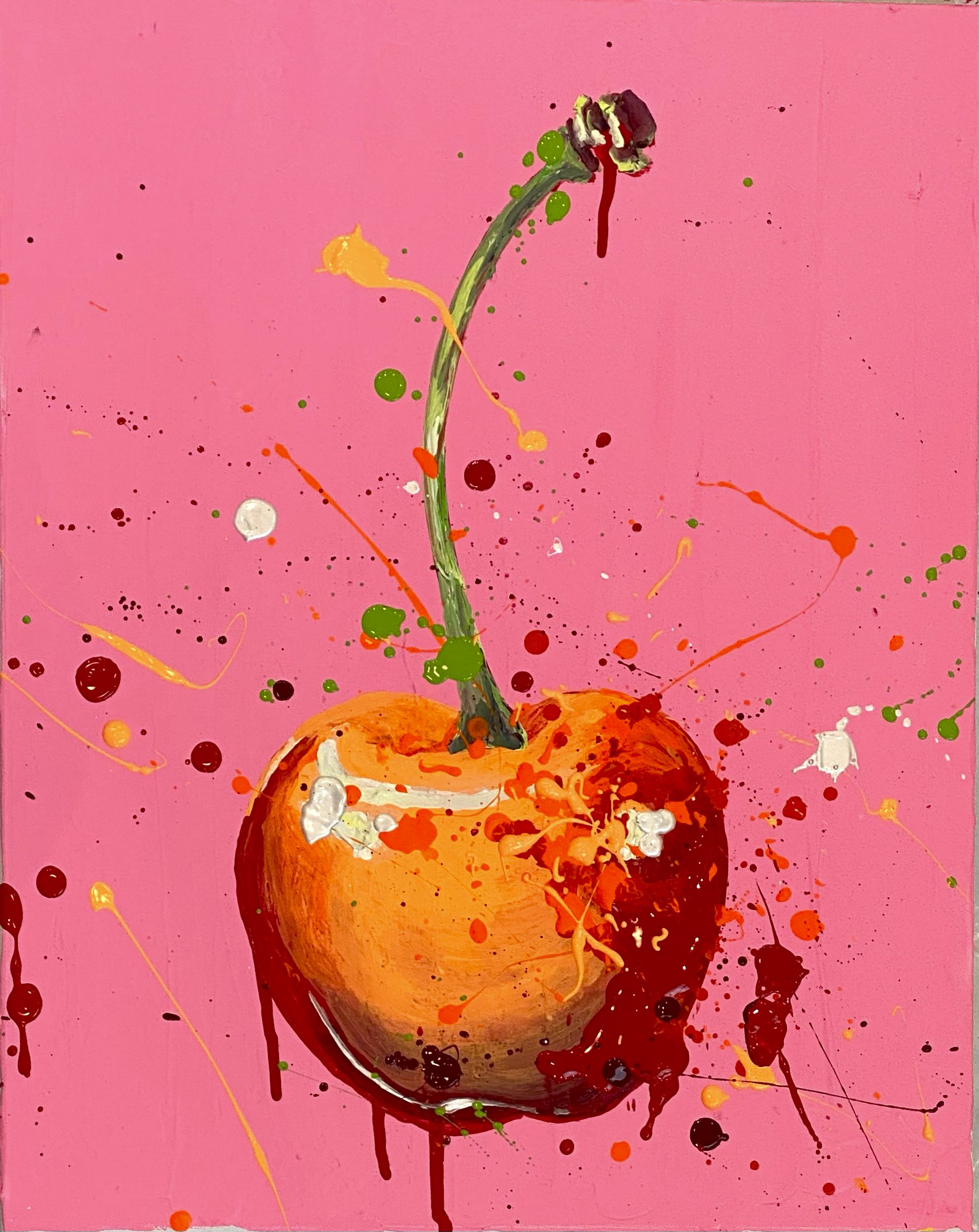
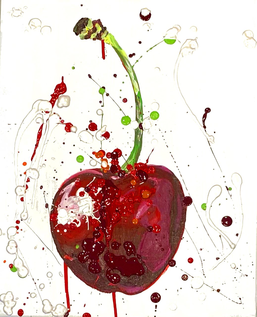
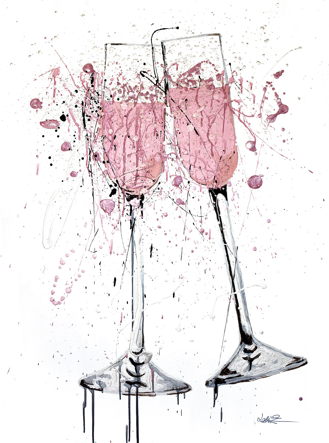
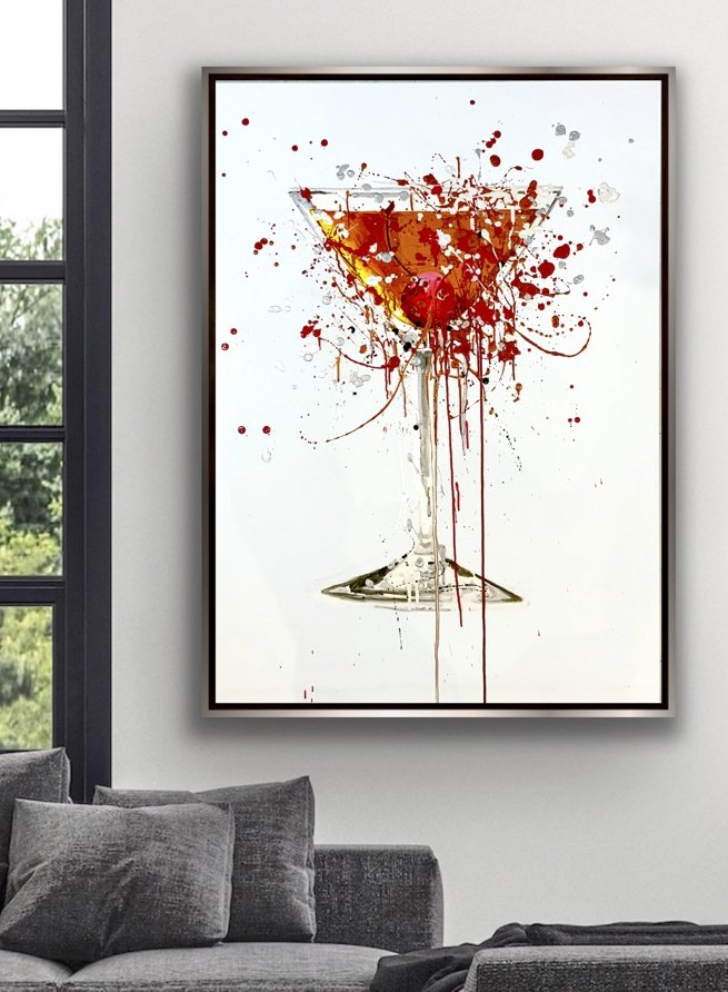
As for my artwork, peach doesn't speak to me. I love bold, bright, saturated colors. I also know contrast provides interest, and peach doesn't add contrast. It tends to soften things. Should I explore my softer creative side? What do you think? Unless I get an overwhelming response from the Universe, I'll stick with my bold colors. And if I have to go back to the '80s, I'm going in fluorescent!


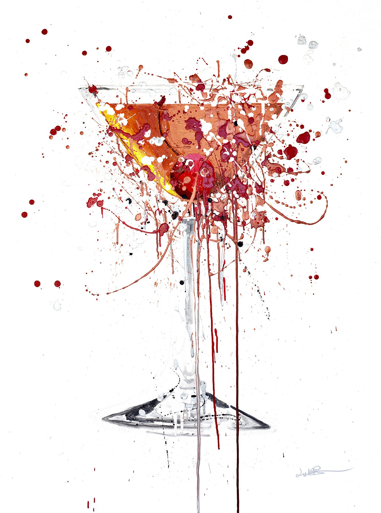
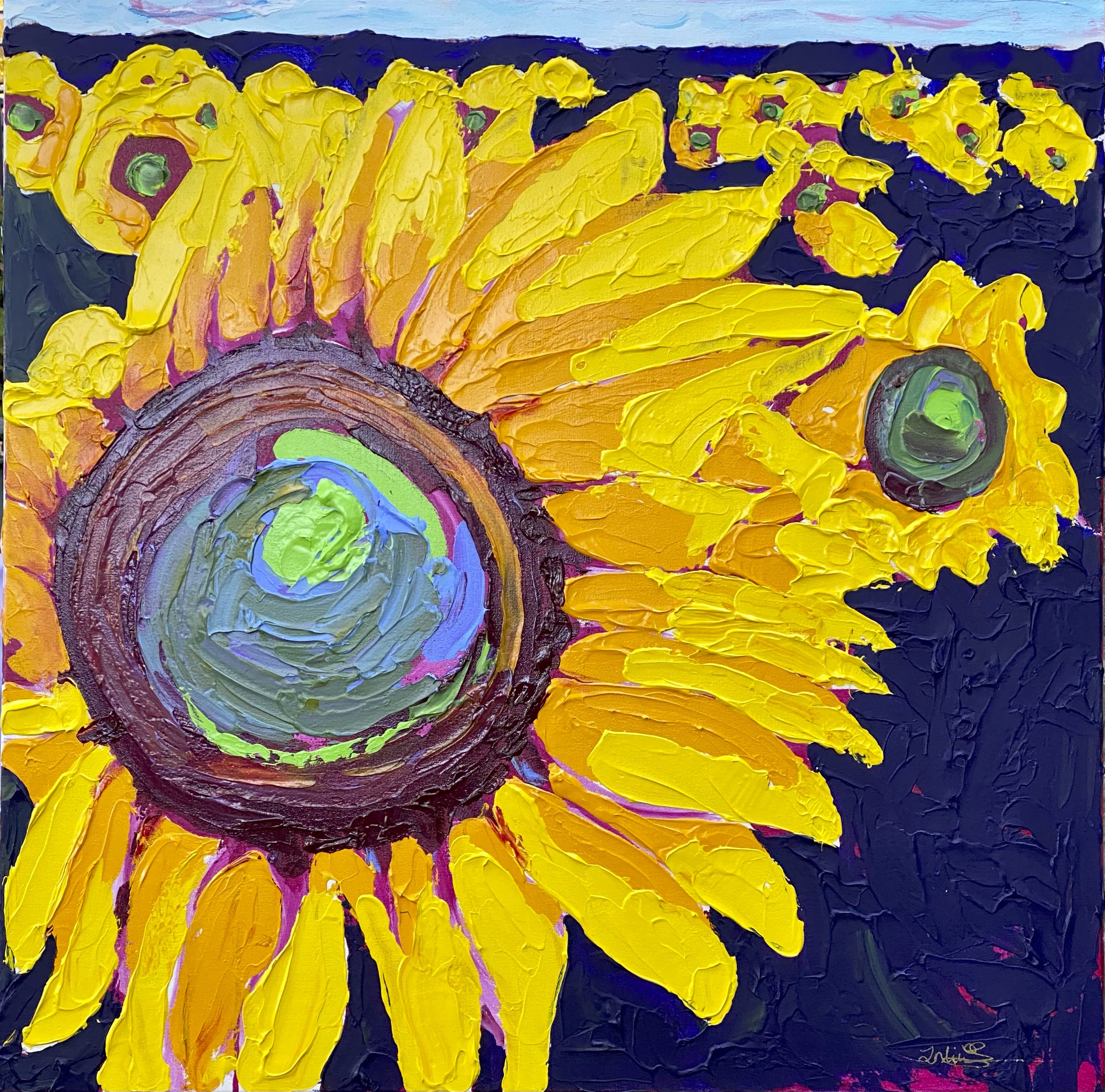
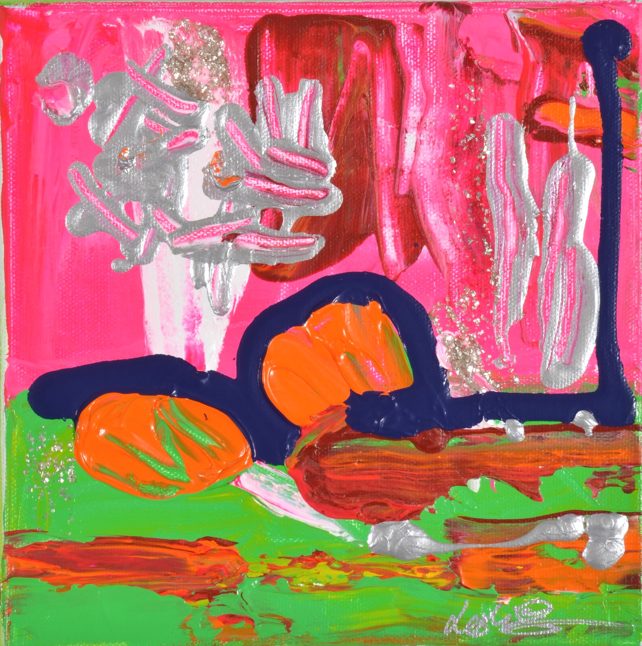
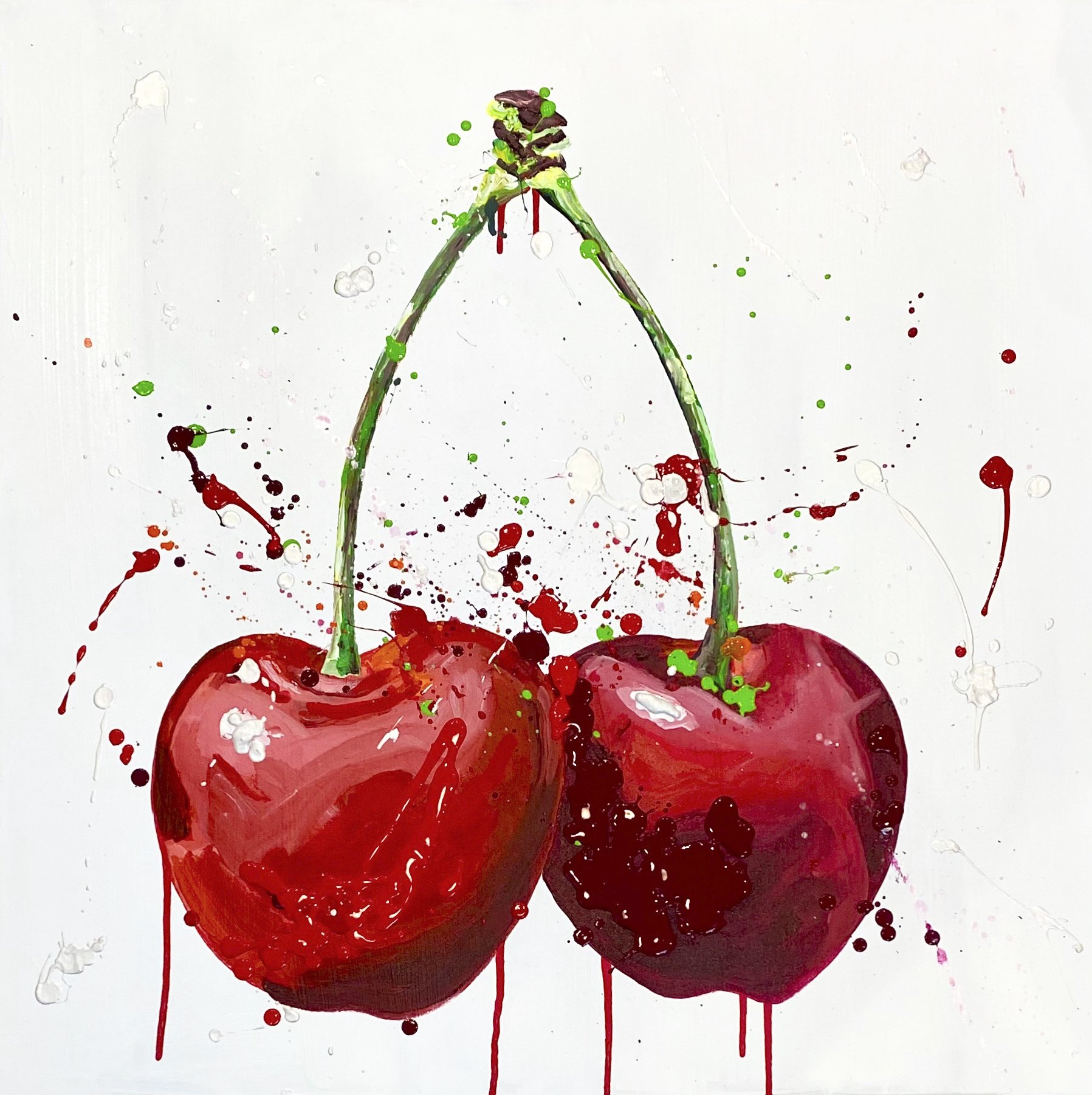
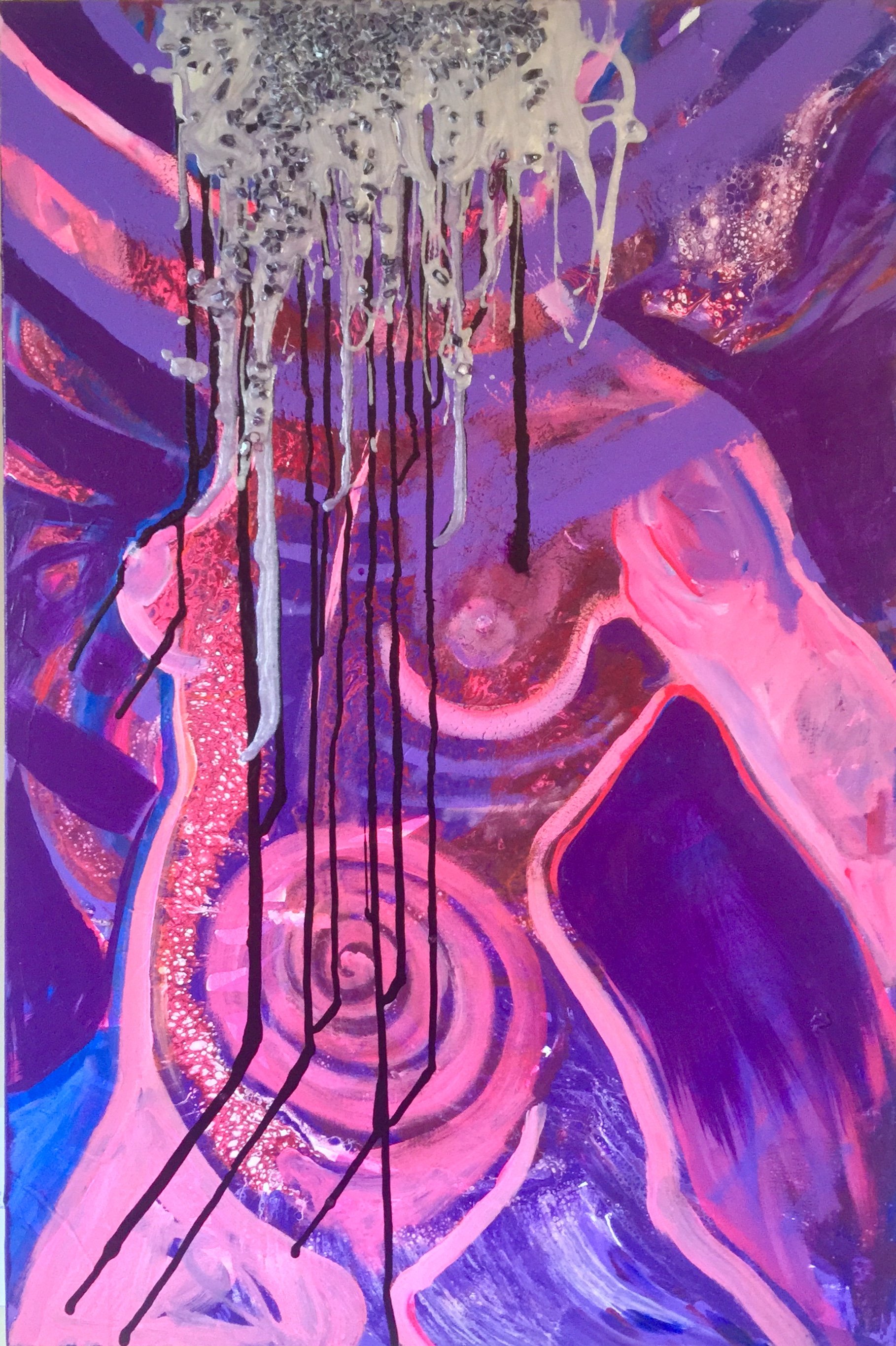
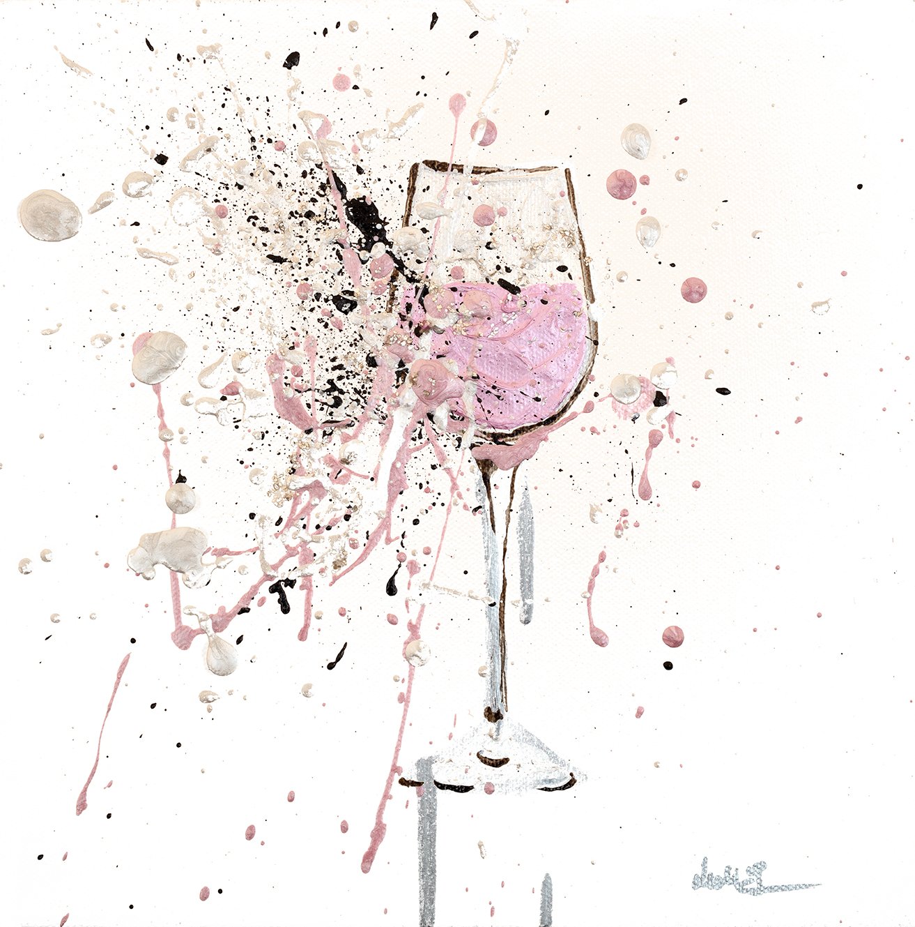
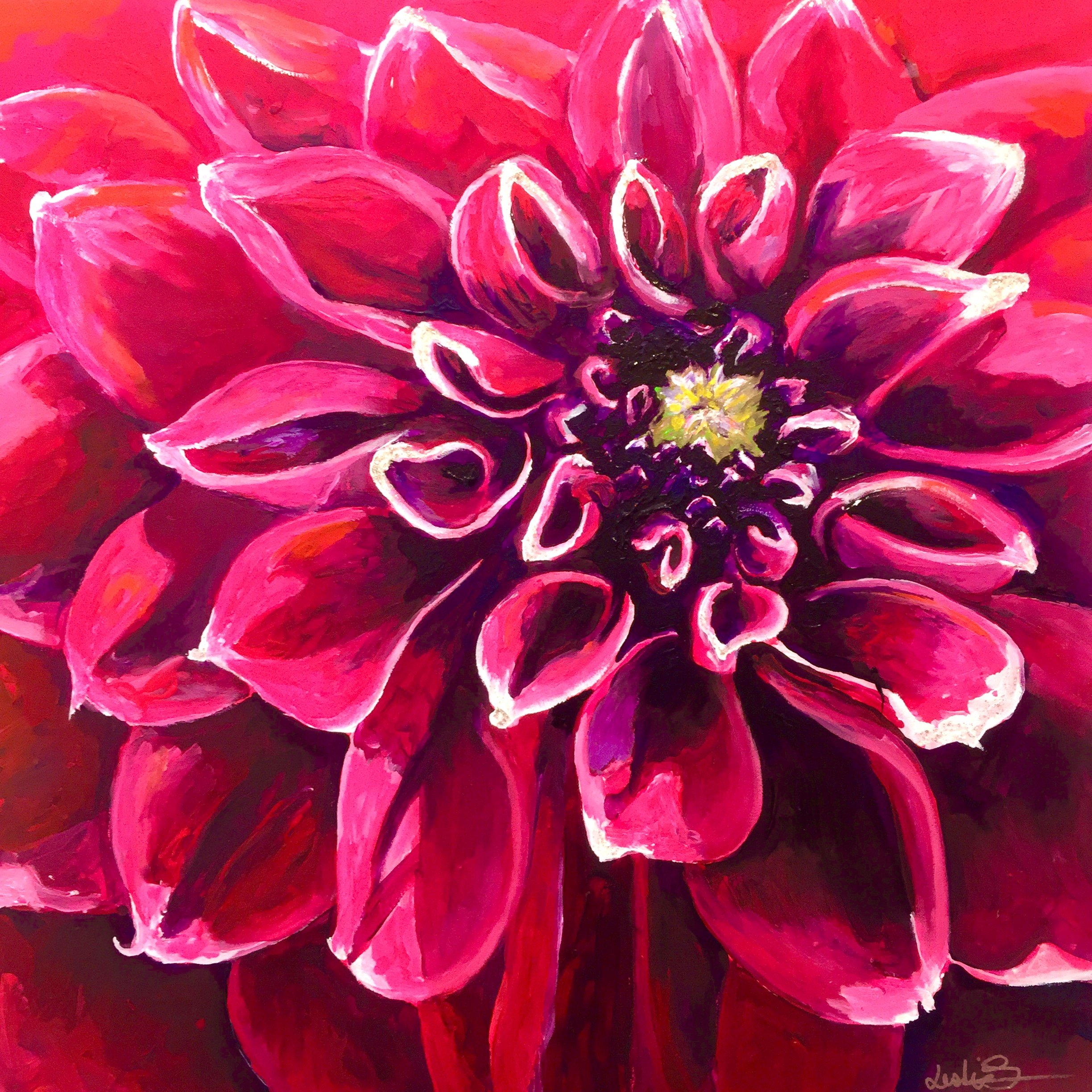
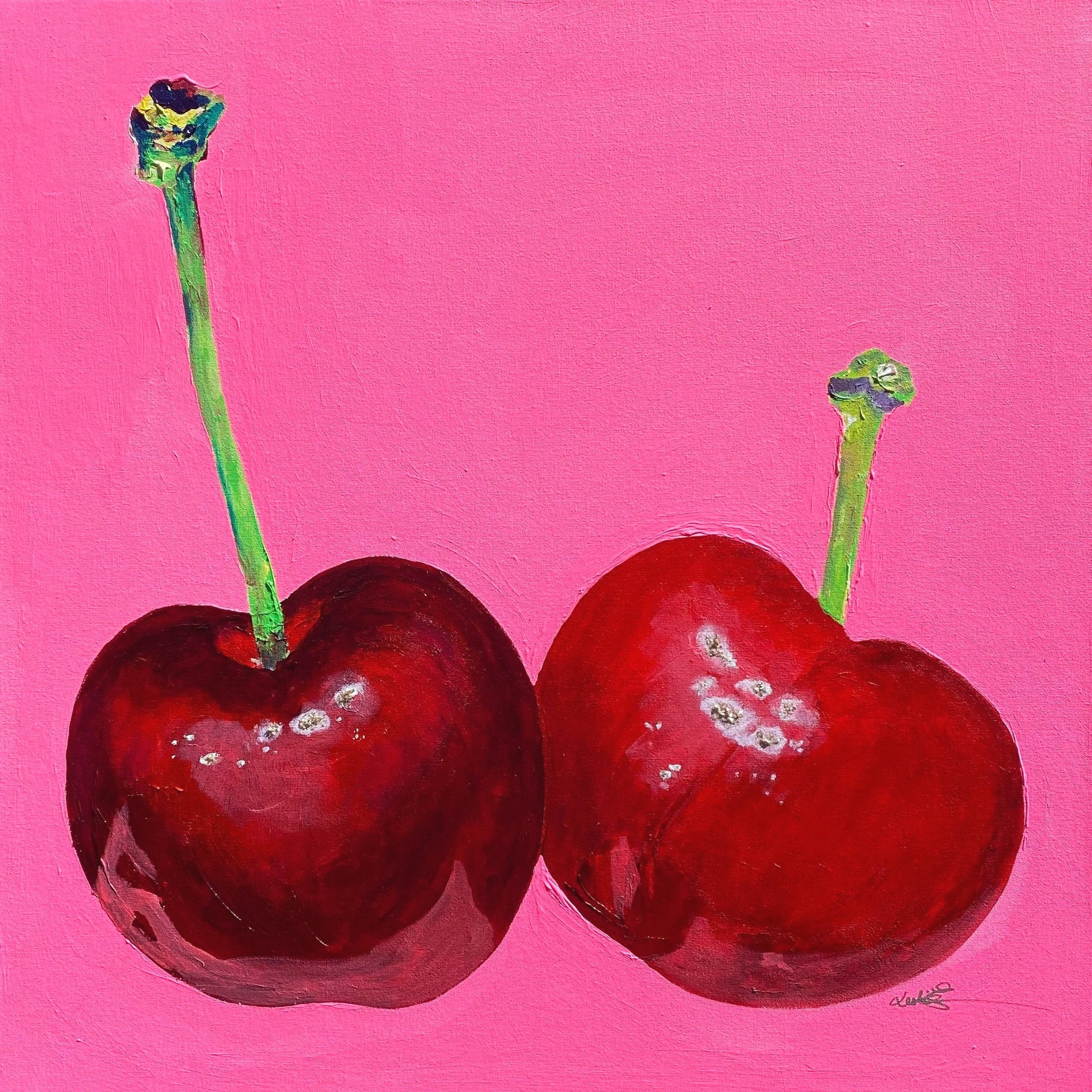
Here are a few examples of my acrylic paintings; as you can see, they are vibrant with bold colors and lots of contrast. See them in person. Click the button to set up a studio visit. I'd love to show you how vibrant they are in real life. I'd also love to have a chat and catch up.

Stay warm and wonderful.

Love,
Leslie


Wanna feel uplifted, excited, sensual and nurtured? Add this to your life.


“Pink isn't just a color. It's an attitude too.”
—Miley Cyrus


Magenta is vibrant, joyful, and fun. It also has a bit of badass in it. It's rooted in red and pulsating in pink—my two favorite colors! So, of course, I'm thrilled about Pantone's choice for color of the year, Viva Magenta 18-1750. I love all the warm hues, from sweet baby pink to sexy cherry red. They make frequent appearances in my paintings. Depending on the shade and value, pinks and reds can be uplifting and exciting as well as sensual and nurturing. These warm colors are very luxurious and I love that too!

Our culture is fully embracing the color pink. Have you noticed? And now that we are approaching Valentine's Day, it's in full bloom. If you'd like to get a meaningful, original gift for yourself or someone else special, Click the images above or the button below to learn more about this collection of pink and red paintings and limited edition prints.

“Viva Magenta PANTONE 18-1750 reconnects us to original matter. Invoking the forces of nature, Viva Magenta galvanizes our spirit, helping us to build our inner strength.”
—Leatrice Eiseman, Executive Director, Pantone Color Institute

I'm practicing some Icelandic phrases for my upcoming trip, and I'm learning to say, "Áttu þetta í bleiku?" —Do you have it in pink?


Happy Valentines Day.
All my love,
Leslie
💖


White and gray can't beat vibrant color. It's time to mix it up!


 “Color is a power which directly influences the soul.”
–Wassily Kandinsky.


DaVinci’s Dahlia With Ant #1 is yellow, blue, orange, purple, and so many more beautiful colors.


This time of change is challenging our courageous hearts. It's a time to shine as our resilient selves and stand boldly in our power. We can step into the uncertain future bravely and fiercely. What color does bravery look like to you? Does it look white and gray or does it look like a vibrant rainbow?

While at the Short Hills Mall last week with my daughter, I noticed that the home stores were filled with white and gray on the showroom floor. The lack of color and warmth felt startling and sterile. "Where's all the color?!" I wailed. Later, while discussing with my artist friends the new Pantone Color Of The Year, I was thrilled to learn that the trends are embracing bold and vibrant color again! In addition, the January 2022 issue of Furniture, Lighting & Decor magazine cover is filled with friendly, inviting, dynamic hues. Those whites and grays just aren't cutting it. It's time to bring color back!


This is the purple wall in my kitchen with my painting, Metamorphosis, hanging on it.


This year's Pantone Color Of The Year is "Very Peri." It's a unique shade of purple that combines cool blue with warm violet-red undertones. "It's the first time Pantone created a new color for the color of the year," stated Laurie Pressman, Vice President of the Pantone Color Institute, "It reflects the global innovation and transformation taking place." Using purple has always been a courageous choice; it encourages personal inventiveness and creativity. As a result, it often feels joyous and dynamic. The walls in my teenage bedroom were deep purple, and now I have an accent wall in my kitchen that's purple. I'm on trend! Yay! Many of us have felt caged in these last couple of years, and whites and grays don't do anything to make us feel inspired or lively. It's time to make our homes cheerful and optimistic by injecting new life into them with color, patterns, and textures. Bold is back in style, and I love it!


White and gray furnishings come alive with the addition of colorful art like Manhattan Mondays.


Color has always been my jam. The walls in my home are filled with color, and my paintings add additional bright, vibrant colors. People often comment on how happy my house feels upon entering. Don't get me wrong, I do like white and gray furnishings and walls, but I love how they look modern and fresh when bold pops of color are added to liven things up. It's time for you to explore your own color sensibility with courage and creativity. Make it fun and take a chance; maybe add something purple.

If you'd like my guidance, I'd be happy to help. So click the link above and set up a Zoom meeting with me. We’ll talk about embracing the colors of the rainbow. Then we’ll find our pot of gold together.

Love,
Leslie